#less css
Explore tagged Tumblr posts
Visit Tumblr Blog
Explore Tumblr blogs with no restrictions, modern design and the best experience.
Last Seen Tumblr Blogs


Fun Fact
In February 2021, Tumblr had 518.6 million blog accounts.
Text
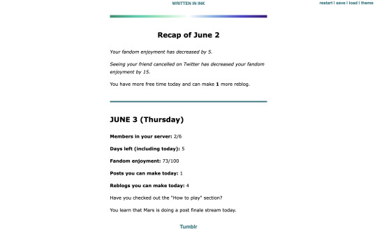
🎈 Bogwaters Demo update!! :D
Formatting update, 2 new NPCs, randomisation feature, and quality of life changes
(Previous post)
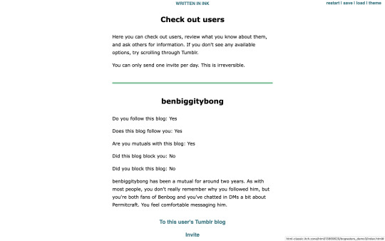
Bogwaters is a free, text-based, interactive fiction browser game about running an underground shipping Discord server in the 2021 MCYT fandom, hosted on itch.io.


Formatting update:
Added more headers. Also added coloured dividers to section off text:
Home: teal
Tumblr: light blue
Discord: light purplish blue (Discord colour)
Ao3: dark red (Ao3 colour)
Messages: yellow
Check out users/invite: light green
Sleep/new day: gay man flag gradient
Trivia: colours for Tumblr, Messages, and Check out users are eyedropped from the old Tumblr UI
Feedback for these colours are welcome!
2 new NPCs:
Now you won't be locked out of winning the game if someone blocks you! The new NPCs are carbonara-art and hippie-benbog with their own storylines and unlock conditions.
New features:
Randomised mandatory daily fandom enjoyment decrease ranging from 3 to 7
Chances: -3 (10%), -4 (10%), -5 (60%), -6 (10%), -7 (10%)
When you sleep, there is a randomised potential +1 increase in reblog (20% chance) and post (10%) quota for the following day. Does not carry past that day.
In addition to blogs of the 2 new NPCs, blogs for doehills, ofthebigwaters, and riversymphony are added. These three are not interactable.
Quality of life changes:
Skippable prologue
Some scenes that don't have bearing on the gameplay are skippable (for this version, it's the conversation with kindredwaves on June 2)
An individual "check out a user" section now has a link to their respective Tumblr blog and vice versa
Misc:
Minor changes to dash content
Minor changes to text formatting
"Days played" shows up as a stat when you get an ending
"Days left (including today)" shows up in the home menu
Reduced animation
Reblogs and feedback are appreciated! Thanks for playing! <3
#interactive fiction#ink#inkle#bogwaters#trafficblr#treebark#life series#mcyt#mcytblr#hi yes. i added gacha#the gradient was gonna be rainbow but it looked soo goofy#this is like middle grade student's first html project#the thing is. ink itself is not very good with css since you can only put a class in one line. can't span multiple lines#so i haven't figured out how to make borders for sections but the dividers should help hopefully#my less ugly css baby...
67 notes
·
View notes
Text
im asking here bc i feel like people here maybe have more experience with this. does anyone know where i could set up a personal blog? i considered tumblr but id like this to be more of a personal experiment rather than tied to a social media site. i dont want to have to pay for a custom domain and dont have enough frontend experience to build something from scratch though,, ;__;
no worries if not, just wanted to ask if anyone has done this! <3
#for ref i can do html/css/bootstrap/backend#angular/typescript esque frameworks and javascript integration big no and idk i want to spend less time customizing more time writing#i already spend too much time coding anyway
56 notes
·
View notes
Text
is this it. will this finally be the day i actually get a decent tumblr desktop theme
#i have less than 0 clue how css works i just want silly myspace blog theme#i mean i literally already have a spacehey account#i just straight up don't use it#so#salem's random thoughts
7 notes
·
View notes
Text

so it just...... doesn't go away
#wtf staff#buggy the clown#i am less likely to watch this show the more you inconvenience me with your advertising of it#i tried to play with the css to make it go away but nope
6 notes
·
View notes
Text
one thing i really appreciate abt AO3 is how once you're using a custom site skin you can just keep adding to it. my site skin now increases font size by 15% AND limits how much space a work's tags can take up AND hides the "you've muted users!" banner. can we go back to having custom css everywhere else
#yelling at clouds#let me resize text on a website by website basis. please. i know better than u how big text shld be.#also if it's in the CSS it's less likely to break shit#as someone who has text set to a 20px minimum on desktop firefox. A Lot Of Sites Break About It.
8 notes
·
View notes
Text
wake up babes, new chapter of What Once Was That One Fic That Was Originally Just A CSS Test But Then I Got Way Too Into It just dropped. and with even MORE positively awful CSS this time !!!!!!!!!!!!
#ijkhm#css cards#ill drop a tutorial if anyone cares about them enough and wants my secrets#and ill probably also drop one if no one cares as well because i know i care and im more than sufficient to comprise an audience#sorry it took so long. the chapter got so big i had to split it into three so 😵💫#you will be fed. i promise#+now that my silly css whims are fulfilled and i made my plugin functional (yippeee!!!) i can focus more on writing and less on othr stuff
4 notes
·
View notes
Note
where did you learn css?
Unfortunately, I have not learned CSS 😎👍 it’s one of the things I need to figure out. I believe the wiki’s CSS code was done by the person who designed the wiki. Their username’s Ggeorgelys - they'd be a better person to talk about it than me
#asks#my two cents (which are probably less valuable than the average two cents) ->#i learned wikicode through looking at pages in source editor and putting what i saw there into practice elsewhere#so i don't really know HTML but i do know most wikicode from observing it wherever i could find it#as much as i want to do the same for CSS it's a lot more complicated to study#but i believe i can learn it!! and i believe you can too anon!!
3 notes
·
View notes
Text
Orbital Mechanics (or How I Optimized a CSS Keyframes Animation)
New Post has been published on https://thedigitalinsider.com/orbital-mechanics-or-how-i-optimized-a-css-keyframes-animation/
Orbital Mechanics (or How I Optimized a CSS Keyframes Animation)

I recently updated my portfolio at johnrhea.com. (If you’re looking to add a CSS or front-end engineer with storytelling and animation skills to your team, I’m your guy.) I liked the look of a series of planets I’d created for another personal project and decided to reuse them on my new site. Part of that was also reusing an animation I’d built circa 2019, where a moon orbited around the planet.
Initially, I just plopped the animations into the new site, only changing the units (em units to viewport units using some complicated math that I was very, very proud of) so that they would scale properly because I’m… efficient with my time. However, on mobile, the planet would move up a few pixels and down a few pixels as the moons orbited around it. I suspected the plopped-in animation was the culprit (it wasn’t, but at least I got some optimized animation and an article out of the deal).
Here’s the original animation:
My initial animation for the moon ran for 60 seconds. I’m folding it inside a disclosure widget because, at 141 lines, it’s stupid long (and, as we’ll see, emphasis on the stupid). Here it is in all its “glory”:
Open code
#moon1 animation: moon-one 60s infinite; @keyframes moon-one 0% transform: translate(0, 0) scale(1); z-index: 2; animation-timing-function: ease-in; 5% transform: translate(-3.51217391vw, 3.50608696vw) scale(1.5); z-index: 2; animation-timing-function: ease-out; 9.9% z-index: 2; 10% transform: translate(-5.01043478vw, 6.511304348vw) scale(1); z-index: -1; animation-timing-function: ease-in; 15% transform: translate(1.003478261vw, 2.50608696vw) scale(0.25); z-index: -1; animation-timing-function: ease-out; 19.9% z-index: -1; 20% transform: translate(0, 0) scale(1); z-index: 2; animation-timing-function: ease-in; 25% transform: translate(-3.51217391vw, 3.50608696vw) scale(1.5); z-index: 2; animation-timing-function: ease-out; 29.9% z-index: 2; 30% transform: translate(-5.01043478vw, 6.511304348vw) scale(1); z-index: -1; animation-timing-function: ease-in; 35% transform: translate(1.003478261vw, 2.50608696vw) scale(0.25); z-index: -1; animation-timing-function: ease-out; 39.9% z-index: -1; 40% transform: translate(0, 0) scale(1); z-index: 2; animation-timing-function: ease-in; 45% transform: translate(-3.51217391vw, 3.50608696vw) scale(1.5); z-index: 2; animation-timing-function: ease-out; 49.9% z-index: 2; 50% transform: translate(-5.01043478vw, 6.511304348vw) scale(1); z-index: -1; animation-timing-function: ease-in; 55% transform: translate(1.003478261vw, 2.50608696vw) scale(0.25); z-index: -1; animation-timing-function: ease-out; 59.9% z-index: -1; 60% transform: translate(0, 0) scale(1); z-index: 2; animation-timing-function: ease-in; 65% transform: translate(-3.51217391vw, 3.50608696vw) scale(1.5); z-index: 2; animation-timing-function: ease-out; 69.9% z-index: 2; 70% transform: translate(-5.01043478vw, 6.511304348vw) scale(1); z-index: -1; animation-timing-function: ease-in; 75% transform: translate(1.003478261vw, 2.50608696vw) scale(0.25); z-index: -1; animation-timing-function: ease-out; 79.9% z-index: -1; 80% transform: translate(0, 0) scale(1); z-index: 2; animation-timing-function: ease-in; 85% transform: translate(-3.51217391vw, 3.50608696vw) scale(1.5); z-index: 2; animation-timing-function: ease-out; 89.9% z-index: 2; 90% transform: translate(-5.01043478vw, 6.511304348vw) scale(1); z-index: -1; animation-timing-function: ease-in; 95% transform: translate(1.003478261vw, 2.50608696vw) scale(0.25); z-index: -1; animation-timing-function: ease-out; 99.9% z-index: -1; 100% transform: translate(0, 0) scale(1); z-index: 2; animation-timing-function: ease-in;
If you look at the keyframes in that code, you’ll notice that the 0% to 20% keyframes are exactly the same as 20% to 40% and so on up through 100%. Why I decided to repeat the keyframes five times infinitely instead of just repeating one set infinitely is a decision lost to antiquity, like six years ago in web time. We can also drop the duration to 12 seconds (one-fifth of sixty) if we were doing our due diligence.
I could thus delete everything from 20% on, instantly dropping the code down to 36 lines. And yes, I realize gains like this are unlikely to be possible on most sites, but this is the first step for optimizing things.
#moon1 animation: moon-one 12s infinite; @keyframes moon-one 0% transform: translate(0, 0) scale(1); z-index: 2; animation-timing-function: ease-in; 5% transform: translate(-3.51217391vw, 3.50608696vw) scale(1.5); z-index: 2; animation-timing-function: ease-out; 9.9% z-index: 2; 10% transform: translate(-5.01043478vw, 6.511304348vw) scale(1); z-index: -1; animation-timing-function: ease-in; 15% transform: translate(1.003478261vw, 2.50608696vw) scale(0.25); z-index: -1; animation-timing-function: ease-out; 19.9% z-index: -1; 20% transform: translate(0, 0) scale(1); z-index: 2; animation-timing-function: ease-in;
Now that we’ve gotten rid of 80% of the overwhelming bits, we can see that there are five main keyframes and two additional ones that set the z-index close to the middle and end of the animation (these prevent the moon from dropping behind the planet or popping out from behind the planet too early). We can change these five points from 0%, 5%, 10%, 15%, and 20% to 0%, 25%, 50%, 75%, and 100% (and since the 0% and the former 20% are the same, we can remove that one, too). Also, since the 10% keyframe above is switching to 50%, the 9.9% keyframe can move to 49.9%, and the 19.9% keyframe can switch to 99.9%, giving us this:
#moon1 animation: moon-one 12s infinite; @keyframes moon-one 0%, 100% transform: translate(0, 0) scale(1); z-index: 2; animation-timing-function: ease-in; 25% transform: translate(-3.51217391vw, 3.50608696vw) scale(1.5); z-index: 2; animation-timing-function: ease-out; 49.9% z-index: 2; 50% transform: translate(-5.01043478vw, 6.511304348vw) scale(1); z-index: -1; animation-timing-function: ease-in; 75% transform: translate(1.003478261vw, 2.50608696vw) scale(0.25); z-index: -1; animation-timing-function: ease-out; 99.9% z-index: -1;
Though I was very proud of myself for my math wrangling, numbers like -3.51217391vw are really, really unnecessary. If a screen was one thousand pixels wide, -3.51217391vw would be 35.1217391 pixels. No one ever needs to go down to the precision of a ten-millionth of a pixel. So, let’s round everything to the tenth place (and if it’s a 0, we’ll just drop it). We can also skip z-index in the 75% and 25% keyframes since it doesn’t change.
Here’s where that gets us in the code:
#moon1 animation: moon-one 12s infinite; @keyframes moon-one 0%, 100% transform: translate(0, 0) scale(1); z-index: 2; animation-timing-function: ease-in; 25% transform: translate(-3.5vw, 3.5vw) scale(1.5); z-index: 2; animation-timing-function: ease-out; 49.9% z-index: 2; 50% transform: translate(-5vw, 6.5vw) scale(1); z-index: -1; animation-timing-function: ease-in; 75% transform: translate(1vw, 2.5vw) scale(0.25); z-index: -1; animation-timing-function: ease-out; 99.9% z-index: -1;
After all our changes, the animation still looks pretty close to what it was before, only way less code:
One of the things I don’t like about this animation is that the moon kind of turns at its zenith when it crosses the planet. It would be much better if it traveled in a straight line from the upper right to the lower left. However, we also need it to get a little larger, as if the moon is coming closer to us in its orbit. Because both translation and scaling were done in the transform property, I can’t translate and scale the moon independently.
If we skip either one in the transform property, it resets the one we skipped, so I’m forced to guess where the mid-point should be so that I can set the scale I need. One way I’ve solved this in the past is to add a wrapping element, then apply scale to one element and translate to the other. However, now that we have individual scale and translate properties, a better way is to separate them from the transform property and use them as separate properties. Separating out the translation and scaling shouldn’t change anything, unless the original order they were declared on the transform property was different than the order of the singular properties.
#moon1 animation: moon-one 12s infinite; @keyframes moon-one 0%, 100% translate: 0 0; scale: 1; z-index: 2; animation-timing-function: ease-in; 25% translate: -3.5vw 3.5vw; z-index: 2; animation-timing-function: ease-out; 49.9% z-index: 2; 50% translate: -5vw 6.5vw; scale: 1; z-index: -1; animation-timing-function: ease-in; 75% translate: 1vw 2.5vw; scale: 0.25; animation-timing-function: ease-out; 99.9% z-index: -1;
Now that we can separate the scale and translate properties and use them independently, we can drop the translate property in the 25% and 75% keyframes because we don’t want them placed precisely in that keyframe. We want the browser’s interpolation to take care of that for us so that it translates smoothly while scaling.
#moon1 animation: moon-one 12s infinite; @keyframes moon-one 0%, 100% translate: 0 0; scale: 1; z-index: 2; animation-timing-function: ease-in; 25% scale: 1.5; animation-timing-function: ease-out; 49.9% z-index: 2; 50% translate: -5vw 6.5vw; scale: 1; z-index: -1; animation-timing-function: ease-in; 75% scale: 0.25; animation-timing-function: ease-out; 99.9% z-index: -1;
Lastly, those different timing functions don’t make a lot of sense anymore because we’ve got the browser working for us, and if we use an ease-in-out timing function on everything, then it should do exactly what we want.
#moon1 animation: moon-one 12s infinite ease-in-out; @keyframes moon-one 0%, 100% translate: 0 0; scale: 1; z-index: 2; 25% scale: 1.5; 49.9% z-index: 2; 50% translate: -5vw 6.5vw; scale: 1; z-index: -1; 75% scale: 0.25; 99.9% z-index: -1;
And there you go: 141 lines down to 28, and I think the animation looks even better than before. It will certainly be easier to maintain, that’s for sure.
But what do you think? Was there an optimization step I missed? Let me know in the comments.
#ADD#animation#animations#Article#Articles#browser#change#code#CSS#CSS Animation#css-tricks#deal#delete#emphasis#Engineer#functions#Giving#how#it#LESS#math#mechanics#mid#Mobile#Moon#Moons#One#optimization#orbit#Other
0 notes
Text
i have done 2 of the website things i intended to do today, and like four things i didn't intend to do, but which will make life easier in the long run
i love hand coding things it's like an endless fractal of 'here's another thing you should've done when you started'
#css should be a smidge easier and less annoying now at least#and i got my js working which is Neat#space does webdev#are there easier ways to make a website? yes#do they provide the same level of enrichment? absolutely not let me type 300 lines of css by hand#it's artisanal
1 note
·
View note
Text
What is XPath?
0 notes
Text
so far the html classes have been a mixed bag in that they have almost entirely taught things i already know pretty well by now (today i walked for 20 minutes in >20° weather to learn the wisdom of how to use <p> and <b>) but then i learn something very very basic that i absolutely should have already known that i already immediately edited into ebony's blog because i realized how stupid the original method i was using was (<br> works much better for the sticky notes than copying/pasting an invisible unicode character 10 times until the line breaks by itself)
#i also learned how to make Actual lists with html using <ul> and <li> and whatnot but it indents too much on the stickynotes sooo idc#i like dash bulletpoints over dot bulletpoints anyway. dots are too round and would look BAD with the pixel font#also learned how to do the fuckin. thing which is NOT keysmash and which is useful to fix a lil alignment in a lazy way#is it technically the same method as copy/pasting that invisible unicode character? maybe. but shut up#there is no actual visible difference in those stickynotes whatsoever btw. they look exactly the same. they're just less stupid now <3#still maybe would have preferred to not have to show up to class for it tho. it could wait. we did not need to be there today.#because the thing is technically it was 23° but it was windy so it was actually 10° and ohhhhhh that walk did not treat me well#was wearing thick plushy fleece-lined pants and my legs still went numb 👍 why did i have to do that 👍👍#also i have discovered that i'm like 80% sure my dorm room's window doesn't close properly#i have discovered that because i'm fucking COLD#sigh. and i Also learned that tumblr skills may have given me more ready knowledge on inline css than my prof. so thats something#college truly is a place of learning and discovery. it was snowing on my way back from class earlier. with just 42% humidity. cool !#i'm very very very rapidly becoming a winter hater can you tell.
0 notes
Note
You're more amazing than lineart
You're more amazing than tag blocking
#fa added tag blocking yesterday!#but only for the modern theme...#which would be fine if the modern theme didn't have a bunch of little annoyances#navigation bars that follow you when you scroll down are the devil#like fuck off! stop following me! if i want to use you then i'll just scroll up it's not that hard#they're called sticky navbars or fixed navbars#i actually messed around with the html and css and found the part that makes it sticky and turned it off#but making a whole browser extension just to make modern theme slightly less bad isn't worth it#other Various Annoyances: the giant raccoon art at the top of every page that pushes the rest of the page down#the submission titles don't turn blue after you've clicked on them so you can't tell which pics you've already clicked#the minigallery on submission pages is awful because they copied deviantart's layout which was not designed for a minigallery#the minigallery thumbnails are cropped more than they need to be which i think might be just straight-up a mistake#also there's a really easy way they could've partially implemented keyword blocking. REALLY easy#the search feature already has a method to exclude results that contain a certain keyword(s)#so just let users make a list of blocked keywords and then alter all their searches to use that method to exclude the keywords#literally just add “-(@keywords blocked_keyword_example)” for each keyword. just take the search string and append that. easy#it'd only work on searches but it would've been so fucking easy but that's irrelevant now#ka asks
1 note
·
View note
Text
In the wake of the TikTok ban and revival as a mouthpiece for fascist propaganda, as well as the downfall of Twitter and Facebook/Facebook-owned platforms to the same evils, I think now is a better time than ever to say LEARN HTML!!! FREE YOURSELVES FROM THE SHACKLES OF MAJOR SOCIAL MEDIA PLATFORMS AND EMBRACE THE INDIE WEB!!!
You can host a website on Neocities for free as long as it's under 1GB (which is a LOT more than it sounds like let me tell you) but if that's not enough you can get 50GB of space (and a variety of other perks) for only $5 a month.
And if you can't/don't want to pay for the extra space, sites like File Garden and Catbox let you host files for free that you can easily link into NeoCities pages (I do this to host videos on mine!) (It also lets you share files NeoCities wouldn't let you upload for free anyways, this is how I upload the .zip files for my 3DS themes on my site.)
Don't know how to write HTML/CSS? No problem. W3schools is an invaluable resource with free lessons on HTML, CSS, JavaScript, PHP, and a whole slew of other programming languages, both for web development and otherwise.
Want a more traditional social media experience? SpaceHey is a platform that mimics the experience of 2000s MySpace
Struggling to find independent web pages that cater to your interests via major search engines? I've got you covered. Marginalia and Wiby are search engines that specifically prioritize non-commercial content. Marginalia also has filters that let you search for more specific categories of website, like wikis, blogs, academia, forums, and vintage sites.
Maybe you wanna log off the modern internet landscape altogether and step back into the pre-social media web altogether, well, Protoweb lets you do just that. It's a proxy service for older browsers (or really just any browser that supports HTTP, but that's mostly old browsers now anyways) that lets you visit restored snapshots of vintage websites.
Protoweb has a lot of Geocities content archived, but if you're interested in that you can find even more old Geocities sites over on the Geocities Gallery
And really this is just general tip-of-the-iceberg stuff. If you dig a little deeper you can find loads more interesting stuff out there. The internet doesn't have to be a miserable place full of nothing but doomposting and targeted ads. The first step to making it less miserable is for YOU, yes YOU, to quit spending all your time on it looking at the handful of miserable websites big tech wants you to spend all your time on.
#this is a side point so it's going here but I really think tech literacy should be a requirement in schools like math grammar history etc.#we live in a world so dominated by the stuff and yet a majority of the population does not understand it at even the most fundamental level#tiktok#tiktok ban#indie web#neocities#web development#current events#twitter#facebook#meta#amazon
11K notes
·
View notes
Text
hyperfixations will have you learning a whole new skill just to make the fanfic you’re writing look kinda nice
#.txt#aka i modified a workskin to make a dumb sdr2 nondespair chatfic#and now i can kinda do simple css#all because i wanted everyone to have icons#and i wanted to include reactions and custom emojis like on discord#it’s hell to write the actual fic but i think i’ve worked out an easier way now#via writing the fic on my ipad like normal and then doing all the html editing on my laptop#using what i wrote on my ipad as a reference#so. less copy pasting#which is genuinely more annoying than just rewriting it for me
1 note
·
View note
Text
Hojas de Estilo CSS: La Magia Detrás del Diseño Web
¿Qué son las hojas de estilo en cascada (CSS)? CSS es un lenguaje de diseño que se utiliza para dar estilo y formato a las páginas web. Separa la presentación del contenido, lo que facilita la creación de sitios web más consistentes y fáciles de mantener. Historia Breve CSS surgió a mediados de los 90 como una solución para separar el contenido (HTML) de la presentación (CSS). Desde entonces,…
#Atom#Bootstrap#compatibilidad con navegadores#CSS#Diseño web#Foundation#frameworks CSS#hojas de estilo#HTML#Less#preprocesadores CSS#propiedades#responsive design#Sass#selectores#Sublime Text#valores#Visual Studio Code
0 notes
Text
🕳
#im actually having a lot of fun on cohost#just made a theme! might bring it over here too but well see!#i might be there more and more and here a little less#i think thats been happening anyway since my posts are mostly queued at the point#im not leaving yet though dont worry!#just the whole coding/ ciss-in-post thing really got me#css**
0 notes